National Autism Strategy brand development

An important part of our work in supporting consultation processes and communication campaigns is helping to design a visual identity, or ‘brand’. One that establishes a consistent and recognisable visual language (colours, graphics, fonts, images, style) across communication materials.
Often, Government consultation processes also have their own identity to show that it’s a process independent of a particular department or agenda. It can help to increase ownership of the process among stakeholder groups, who also apply the brand to their promotions and communication resources to support the process.
One example of this is the design of the brand for a national consultation process to develop the new National Autism Strategy. The brand developed for the consultation process was so strong that it’s also been used in the final Strategy, published in January 2025.
Concept design
The goal of designing a brand for the National Autism Strategy was to make sure people could see themselves in it.
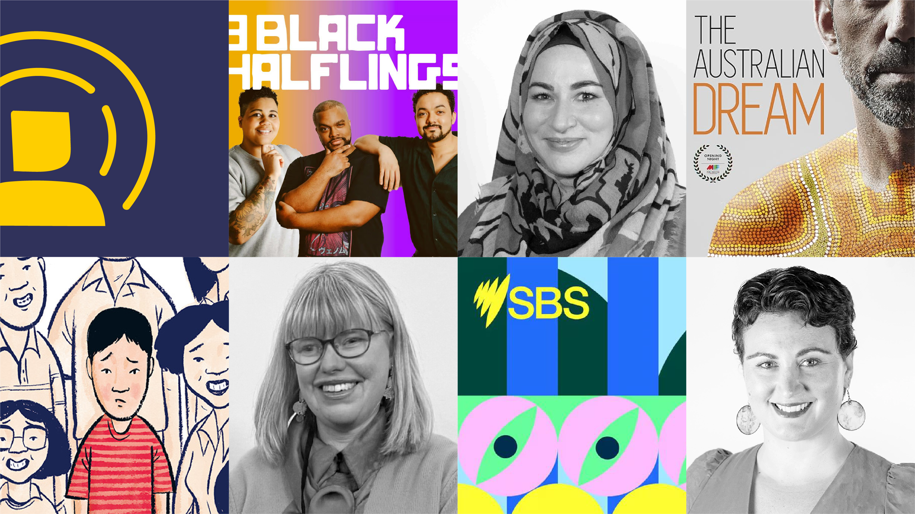
Autistic people and the autism community are diverse. So it was important to make sure the visual assets would represent this diversity. That included people of all ages, including autistic adults, and people who are from the priority audiences that we knew the Strategy wanted to represent, such as First Nations people, multicultural communities, people with intellectual disability and people part of the LGBTIQA+ community and older people,
To develop the brand, we involved representative stakeholders in the concept design process, to ensure the brand would be suitable for the intended audiences.
We started the process by defining key design principles to guide the concept design. The brand needed to be: human-centred, warm, inclusive, accessible, and reflective of diverse communities.
The thread that featured through the products provided us with an easily recognisable set of colours to apply to certain topics and issue areas we were consulting on. It also represented that this would be a journey, and not a linear process.
Another important consideration was that, within the diversity of graphics, all the brand elements (colours, graphic devices, illustrations, icons, and photography) needed to work together cohesively. This allowed for a diverse range of brand applications and to support the different communication needs and settings we wanted to apply it to.

Bringing the brand to life
It was highly rewarding to see the final brand come to life and help facilitate awareness and engagement throughout the National Autism Strategy consultation process.

The brand’s bright, bold colours made it readily recognisable, warm and approachable. The hand-drawn, contour-line style illustrations and icons are friendly, human-centred, and can be easily adapted to represent diverse audiences.
With the benefit of having in-house design, illustration, animation and video production, we were able to bring the visual elements of the concept to life across many mediums and products.
It worked seamlessly across a multitude of print and digital assets, including information sheets, reports, banners, presentations, postcards, social media, web assets, video interviews, and animated explainer videos.
What we learnt
We received a lot of positive feedback about the use of the brand during the consultation process.
Three key learnings from this branding and communication application included:
- Taking a collaborative, holistic, and human-centred approach to the design development was critical to the success of the brand overall.
- There are a range of ways to represent diversity and ensure there is intersectionality in that diversity. Using a mix of illustration and photography worked well to do this without having people feel excluded from the process. We were also able to adapt and use different parts of the brand when events targeted specific audience groups.
- Imagery is still key. The use of photos and imagery was required to accompany the visual aspects of the brand. However, photos can also be the most sensitive application in a consultation process. For example, there were some concerns raised by autistic people during engagements about the use of children in photos given the Strategy would be representative of autistic people of all ages.
We look forward to taking the learnings from this project to future consultations and engagement branding work.


.png)


